

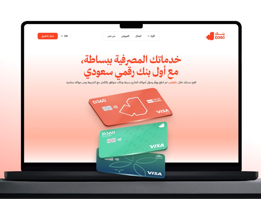
D360 Bank Live
D360 Bank: turning a slogan-led website into a clear path to the app
Overview
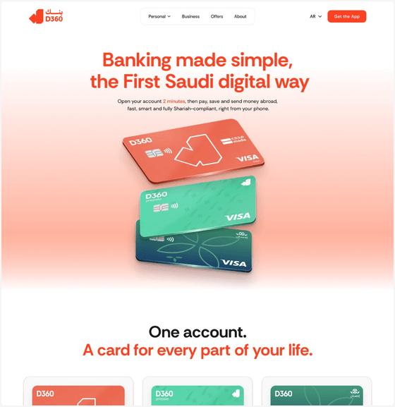
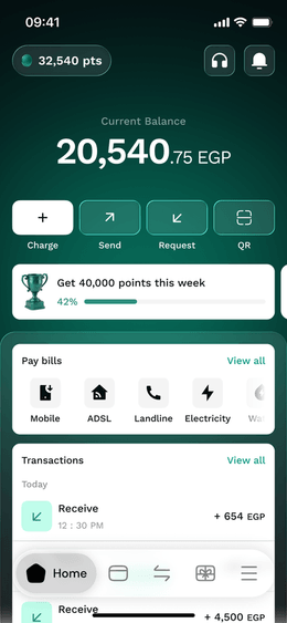
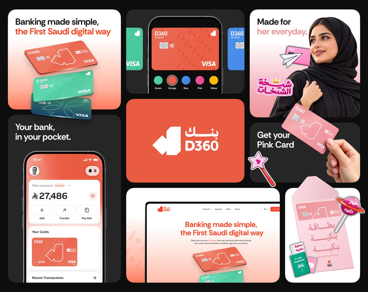
D360 Bank is a Saudi digital bank that lets people open an account in 2 minutes, then pay, save and send money abroad, all fully Shariah-compliant. This conversion-rate UX audit and redesign turns the website into a simple, trustworthy route to the app: real stats, genuine trust signals and one clear next step.
MissionMaking the D360 website a simple, trustworthy route to the app: real stats, genuine trust signals, and one clear next step.
Problem / Goal
- The products are solid, but the website buries them under slogans.
- The new site should focus on one clear action.
- It should include genuine trust signals.
- It should showcase every product upfront.
What I did
- UX audit
- First-time visitor journey
- Conversion-rate analysis
- Problems & solutions mapping
- Information architecture
- UI redesign
- Arabic RTL & English
- Responsive web
- Front-end build
First-time visitor
Ten steps from a TikTok ad to closing the tab.
29Saudi professional · Android · came from a TikTok ad about cheap transfers
- 01
A cookie banner blurs the whole page.
Mildly annoying - 02
“TRAVELERS BEST BANK” doesn’t match the ad, and the button is half cut off.
- 03
“+3,000,000 million customers.”
First crack in trust - 04Exit
A long empty scroll, and the logo is gone. The page looks broken.
Biggest exit risk - 05
“Best exchange rate?” but no actual rate.
Wants to compare elsewhere - 06Exit
“Learn More” switches the page to Arabic.
Second exit risk - 07
The transfers page shows no rate; countries are hidden in an FAQ.
- 08
“Transfer now” jumps straight to Google Play.
Feels pushy - 09
The financing calculator shows zeros.
Looks broken - 10Exit
The Customer Protection link is broken.
Leaves
- Exit 1The empty scrolling section on mobile
- Exit 2“Learn More” switches them to Arabic
- Exit 3No actual exchange rate to be found
- Exit 4The broken Customer Protection link
The products are strong, but the site gives visitors no clear way to download the app.
Problems & solutions
Turning a slogan-led website into a clear path to the app.
- 01 Problem
The only sign-up button, “Start your journey”, shows a bare QR code on desktop and jumps straight to Google Play on Android.
01 SolutionOne clear “Get the App” button, repeated through the page, with App Store and Google Play badges.
- 02 Problem
Every claim, like “best rate” or “no hidden fees”, is a slogan with no numbers behind it.
02 SolutionBenefits with real numbers: 2 minutes, 100% Shariah, SAR 0 fees, 4.49% APR and up to 3% profit.
- 03 Problem
Trust breaks early: the customer count literally reads 3 trillion, and SAMA regulation is buried in the footer.
03 SolutionTrust up front: a 4.8 rating from 41.5K reviews and 3M+ customers right next to the app.
- 04 Problem
The homepage sells travel only, while financing, savings and Musaned never appear.
04 SolutionEvery product shown up front: cards, transfers, financing, Sanabil savings and Musaned, each in its own tile.
- 05 Problem
The three homepage “Learn More” links send English visitors to the Arabic site.
05 SolutionLanguage stays consistent: one EN / العربية switch in the header, and every section exists in both languages.
- 06 Problem
On mobile the button is cut off, followed by about 1,500px of near-empty scrolling, and the logo disappears.
06 SolutionA compact mobile hero: headline, button and cards fit the first screen, and every scroll shows real content.
Our approach
Five ideas shaped the new website.
Numbers, not slogans
Every benefit is a real figure: 2 minutes, SAR 0 fees, 4.49% APR, up to 3% profit. Visitors can compare D360 in seconds.
Arabic first
Built right to left from the start, with a full English version and a one-tap language switch.
Personal and playful
A card colour picker and the Pink Card campaign (for Saudi women) make the bank feel made for you.
One clear action
A single “Get the App” button, repeated through the page, with App Store and Google Play badges right under it.
Trust where you decide
The 4.8 rating, 41.5K reviews and 3M+ customers sit right next to the button, not buried in the footer.
Keywords
- UI/UX
- UI design
- UX audit
- Web design
- Landing page
- Website redesign
- Conversion optimization
- Fintech
- Digital banking
- Bank
- Credit card
- D360 Bank
- mada
- stc bank
- Barq
- Revolut
- Arabic
- Saudi Arabia
- KSA
- Mobile design
- Mobile app
- Motion graphics
- UI animation
- Figma